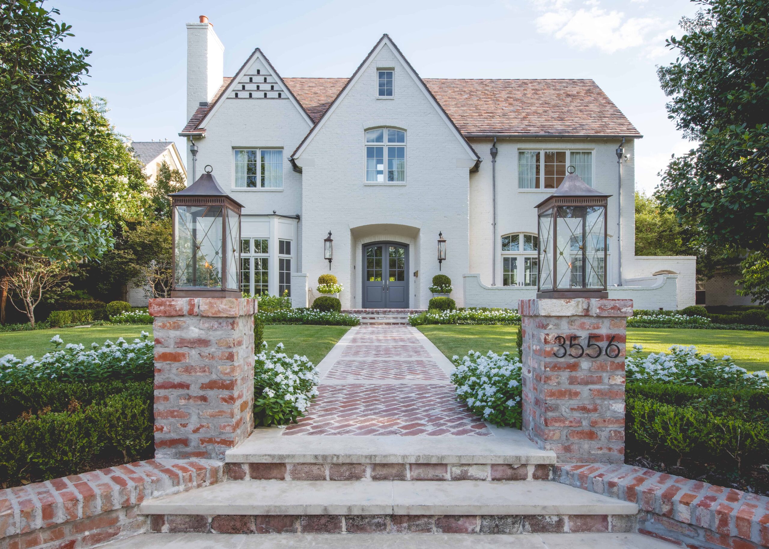
Someone once told me that vegetation is to architecture as a wall finish is to a room. I’ve always believed in this and we practice this theory on every project. However, it’s more than just placing vegetation in front of a piece of architecture that lets it speak to you. The vegetation has to be specific and have the proper texture, color, and form. Then it needs to be organized in a way to blend into the surrounding environment and to reflect the rhythm of the architecture.
Project Colgate Avenue was predominantly a planting centered project. It had amazing architecture and great foundational elements to work with. A pool/fountain as well as a patio cover for the backyard were also part of this design project. The planting, however is what really made the architecture and the rest of the property have a story and come to life.
Working with Great Architecture
This home in University Park, Texas amazed me when I first saw it. The home was designed by Fusch Architects and built as a spec home by JD Smith Custom Homes. The new owner had just bought the home and engaged Matthew Murrey Design to make some improvements.
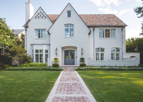
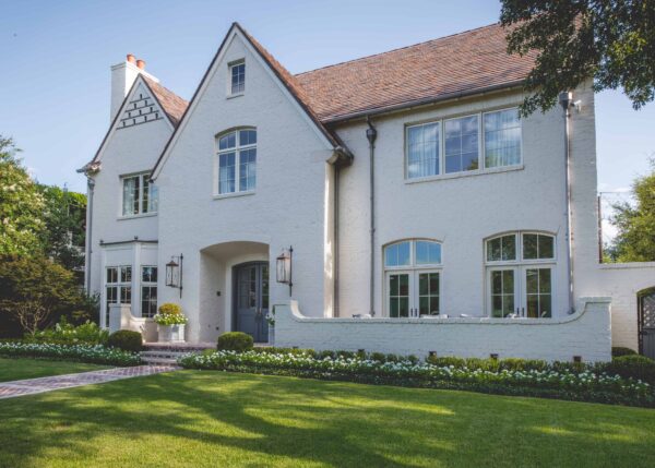
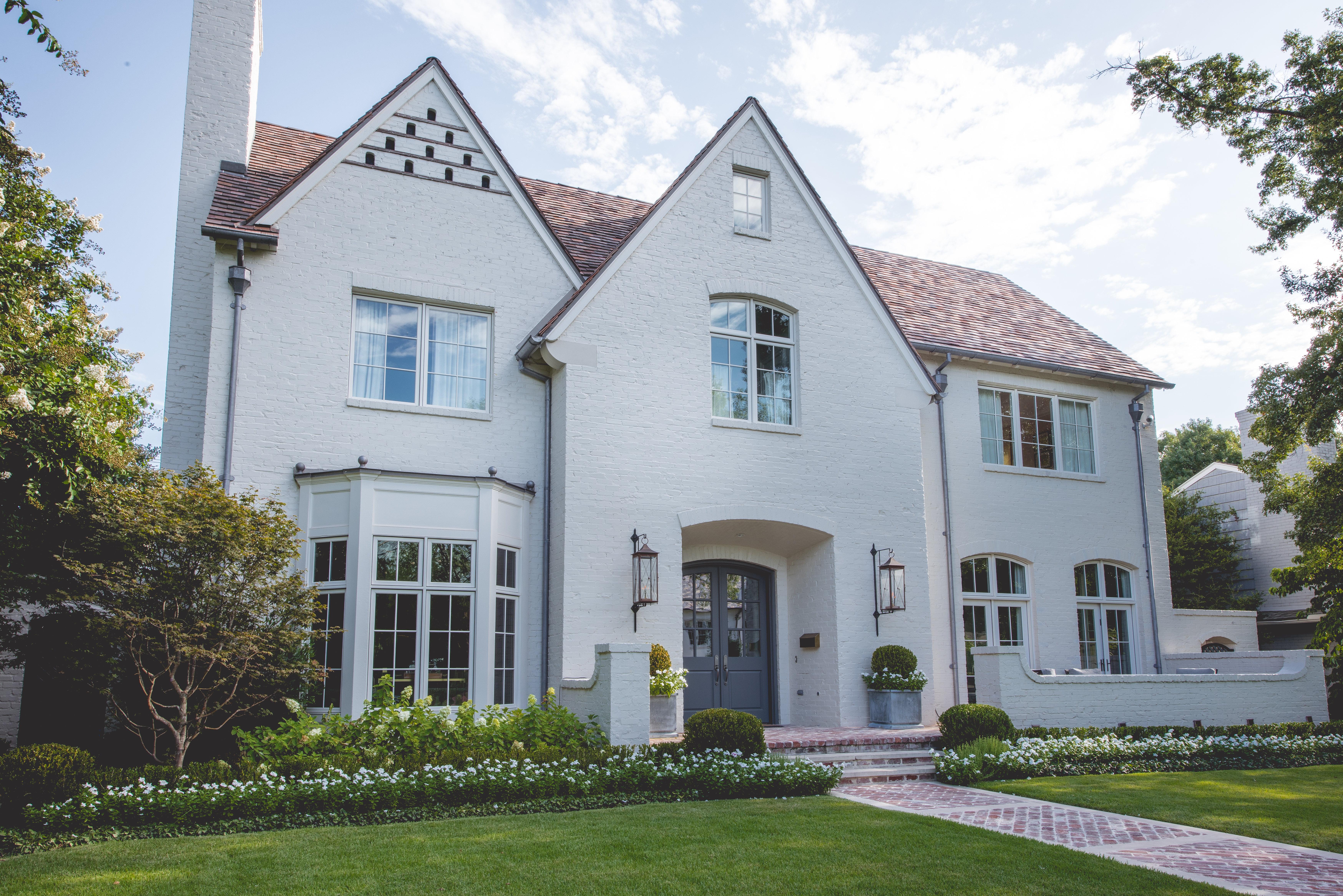
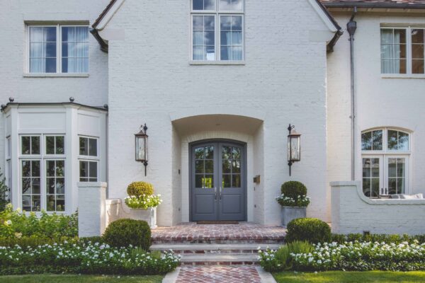
The home had great architectural presence and a fabulous ensemble of finishes. The exterior was painted brick and finished in a marvelous soft, warm white paint. The color was not recorded, but I would think Benjamin Moore’s White Dove or Cloud White would be comparable options. The roof had one of my favorite materials – antique clay tile. The style of the home reminded me of the architecture you might see in Normandy, France but cleaned and refined for today’s modern family.
A Properly Coordinated Hardscape
The greatest thing I noticed, besides the architecture on the property, was the antique brick paving. Smith’s use of the antique brick was perfect. It captured the red and terra cotta tones of the roof, and even includes some old remnants of white paint from its previous life.
At the street, stood an antique brick wall, steps, and columns. I loved the way they left these structures unpainted. The contrast brought interest to the property and seemed to help create a narrative for the landscape. Overall, I think the hardscape decisions before MMD came into the picture were executed extremely well. This provided a great canvas for us to work with.
Front Yard Design
For the front yard, there were four specific areas to consider when I started organizing the gardens. The streetscape, the lawn, foundation plantings, and front porch. It was also important that the landscape design was in keeping with the architecture. To do this, I opted for a simple plant palette that was monochromatic and resembled a modernized version of a classical garden.
Streetscape
It was critical to me that I kept and used the existing antique brick wall, steps, and columns. I wanted to use these elements to build a garden that would create privacy and also enhance the view from inside the home out. The design included a pleached hedge of East Polatka holly, with a garden below of Buxus and Azalea. There was also room for a seasonal collection of showy flowers.
We opted to remove the existing wood gate. Well, actually the city forced us to remove it because it did not meet code. At the end of the day, I think removing the gate actually made the home more approachable and added to the excitement and experience of arriving to the property. We did add gas lanterns to the columns to match the front porch lanterns. Copper Sculptures did an amazing job creating these pedestal mounted lights for us.
Lawn
Allowing for an expansive lawn was important for a couple of reasons. First, the backyard was fairly compact and intimate, so there was not much room available for the kiddos to play. Second, the lawn adds to the arrival sequence. For the lawn, we used Zeon Zoysia. This is probably the finest bladed of the Zoysia varietals. Its extremely dense, and ideally kept at approximately 2-3 inches in height. The color of the Zeon Zoysia is great too. It’s vibrant and really allows the surrounding landscape to have great contrast.
Foundation Planting
The foundation planting scheme was very simple. We used Buxus hedging, Monrovia Limelight Hydrangea, and vinca minor ground cover. There was also room for another swath of beautiful seasonal flowers. The flowers shown in these images are ‘Cora’ White Vinca, aka Periwinkle. The ‘Cora’ variety is a little more tolerant to the Dallas, Texas heat and humidity and it does not have the pink center like is common with standard Vinca flowers.
I also added a mature Japanese Maple to the left side of the home. This tree really helped separate this property from the neighbors, and the red/orange color connects nicely with the terra cotta roof and brick paving.
Front Porch
The front porch was the final area of the front yard design. The beautiful gabled architecture, gas lanterns, and front door were all too lonely and begging for a good companion. I used Restoration Hardware’s Estate Footed Planter with a weathered zinc Finish. The weathered zinc finish was a nice connection to the guttering and the roofing and finial decor of the front bay window. We coordinated the planter with the rest of the garden by planting them with specimen Buxus Globes.

Back Yard Design
The backyard was somewhat of an empty, blank canvas. The owner asked us to add additional covered patio space, incorporate a fountain, and add a small pool.
Combined Pool and Fountain
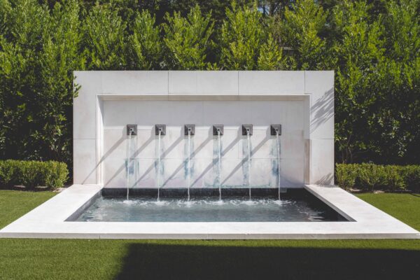
I decided to design the small pool and fountain into one element. Since the yard was fairly small, incorporating these items together made perfect sense. The spa wall is clad in limestone and features custom lead coated copper scuppers. The pool features a perimeter bench, spa therapy jets, and a heater for year-round use.
This was such a great feature to this backyard. The carved limestone resembled somewhat of a an old architectural relic. It was a refined piece of architecture that the backyard really needed.
Patio Cover with Reclaimed Materials
Fusch included a covered patio to the back of the house. It flowed out of the living room and was a nice scale for the home. The owner, however, wanted more patio cover space for entertaining. The existing covered patio was already fairly deep so I did not want to simply add on to the area and make the space deeper and darker.
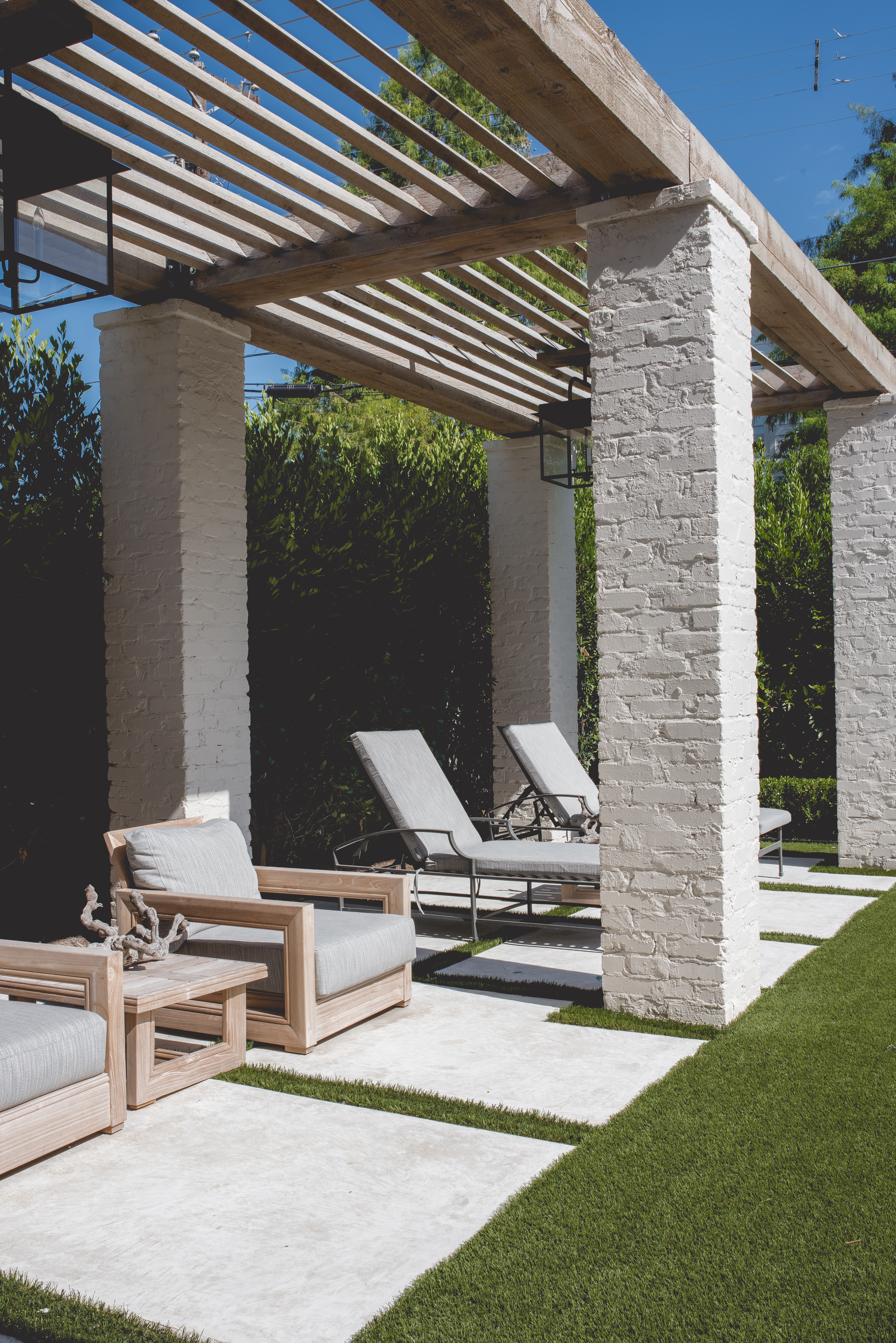
I decided to place the patio cover along the side yard and keep the center of the yard more open and useable. The design of the structure resembled the hardscape structures of the front yard. We incorporated antique brick into the columns and reclaimed Douglas fir intro the beams and shade louvres. We did not use any stain or finishes, as we wanted to maintain the natural, unfinished quality of the materials.
Privacy Hedging
I personally do not like to see fencing (unless the fencing is specifically designed, and properly detailed in a way that is meant to be seen). For this application, I did not want to see the fence. Instead, I wanted to create a dense evergreen backdrop to allow the structures to rest against and stand off of. I used Monrovia ‘Bright and Tight’ Laurel for this application. It conceals the fence and even camouflages the power lines running above.
Artificial Turf
If you know me at all, you know that I am not a huge fan of artificial turf. First of all, it’s fake, and second it gets extremely hot in direct sunlight. As we all know, there are always exceptions. Artificial turf can be an extremely functional surface. It can be used as a lawn and also double as a paving surface. For this project, artificial turf was a great fit. It provided lawn area, but it also gave the owners a vast amount of entertaining space. So for this application it made perfect sense and I think it was a great design decision for this application.
As I mentioned in the beginning, I think the planting is really what pulled this project together. The planting added the texture, color, form, and rhythm that the property needed. Then we added a few elements, such as the gas lanterns and front porch planters to finish it off. I just love the way this project came together!

